Home » The Impact of Color Theory in Home Design: The Perfect Palette for Every Room

The Impact of Color Theory in Home Design: The Perfect Palette for Every Room
The impact of color theory in home design can be achieved with the perfect palette for every room of your home. Colors speak silently. The instant feel of a particular energy or emotion as you enter a particular room can be attributed to the impact of color.
Furthermore, colors invoke different feelings and emotions we experience every day. They also create an energy aura in our spaces. Judiciously planned color combinations can foster positive emotions and feelings like serenity, peace, and happiness. In contrast, improper combinations can create discomfort, anxiety, or even anger.
In addition, colors shape your feelings at work, leisure, or during get-togethers, and should not be used merely to look good. Therefore, it is vital to remember that a well-thought-out home color palette has the power to usher in positive energy into any space.
Moreover, emotions, purpose, and personal style get to sing in harmony to uplift your spirit every time with the right color palette. Therefore, understanding the warmth of beige or the exciting pop of teal is vital. Additionally, this insight helps in planning seasonal decor for your favorite rooms.Why Colors Matter More Than You Think
To begin with, the impact of color theory in home décor is a vital part. Knowing color theory helps you to learn how colors interact and speak to you. A burst of vibrancy in kitchens to serene shade in bedrooms can make the difference. Color theory is the tool helping you to design every room with intention and mindfulness.
Moreover, from designing a chic apartment to a snug and laid-back farmhouse, the right color palette will give a fillip to the aura and ambiance of the rooms. Likewise, in the same way, sprucing up for festive spring or bringing in the cool vibe in summer, let us read on to learn more.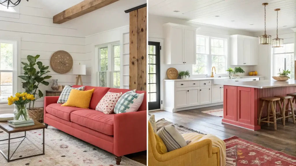
Basics of Color Theory
To begin with, the primary, secondary, and tertiary colors on the color wheel define the color theory. How we mix, match, and perceive these three tributaries on the wheel makes all the difference.
- Monochromatic Serene: A cohesive combination of calm shades of a single color in harmony.
- Analogous Harmony: The soothing blend of colors beside each other on the wheel.
- Complementary Diversity: Diverse contrast and energetic opposite combos like blue and orange.
- Triadic Trio: Bold, balanced, and evenly spaced triple combo hues.
Choosing Colors Room by Room
Living Room
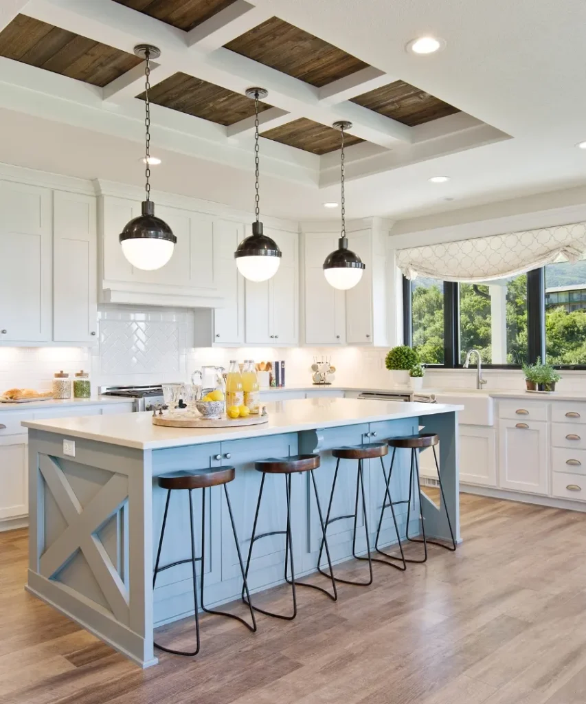
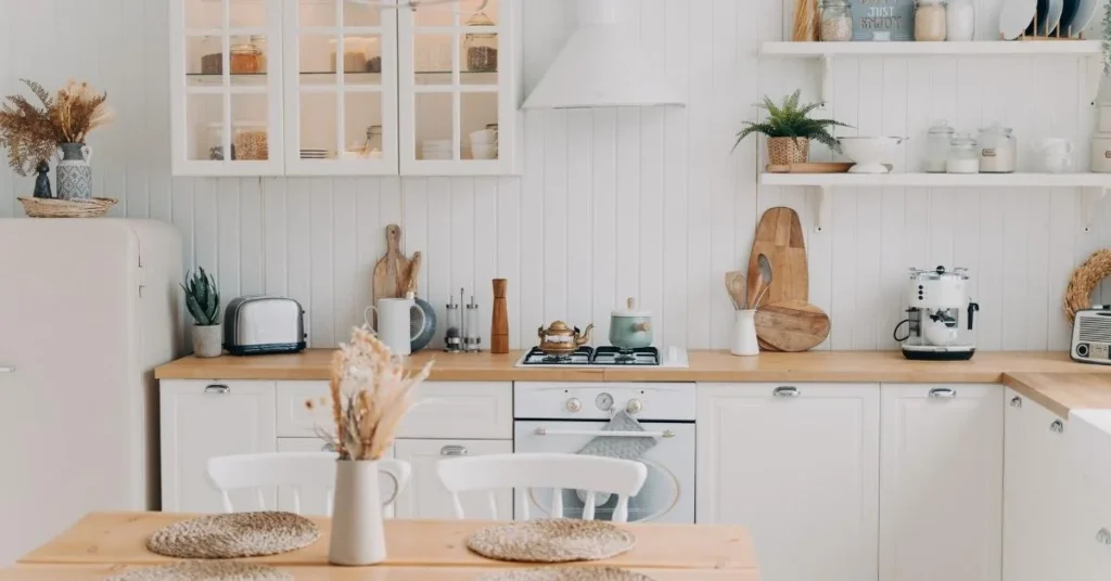
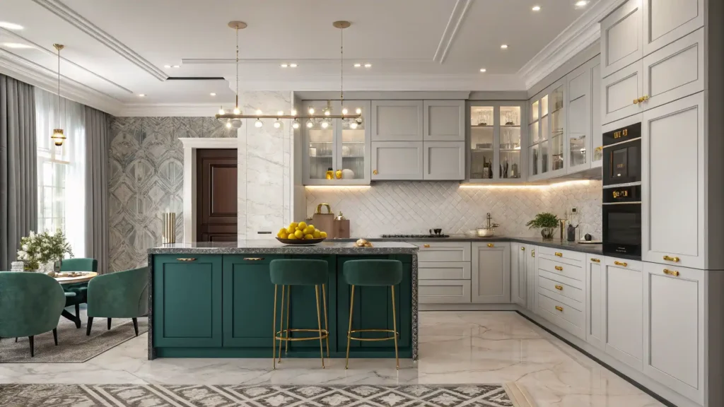
Kitchen Area and Dining Space
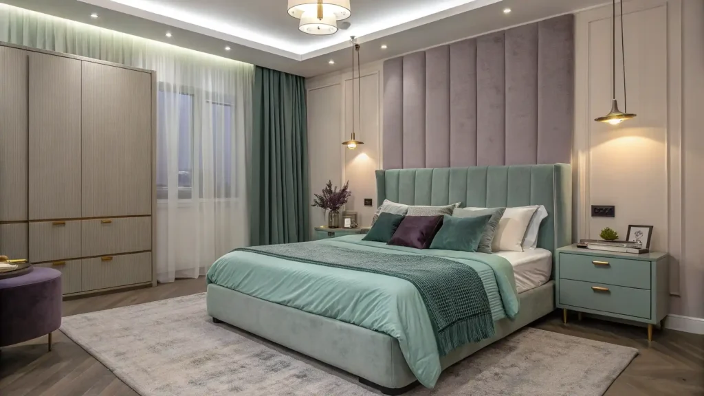
Bedroom
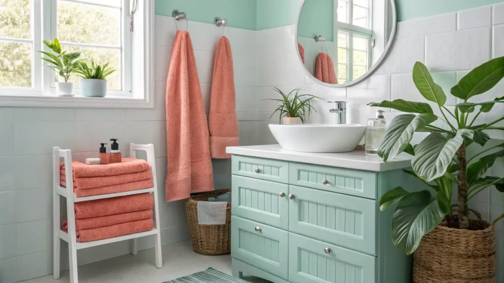
Bathroom
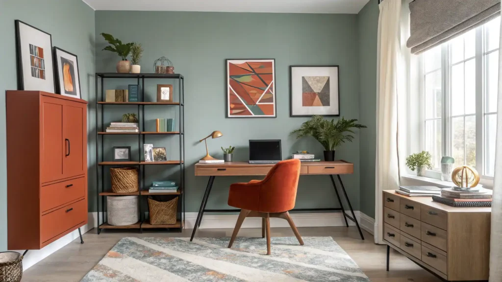
Home Office
How Your Style Influences Home Colors
- Modern Chic: Black and white accentuated with bold pops for contrast and neutral aura.
- Farmhouse Rustic: Vintage finishes added with wooden textures with subtle greens, nuanced blues, and warm cream shades.
- Coastal Reggae: A breezy coastal rhythm with light, airy tones like sea blue, beige, and sharp white.
- Boho Radical: Go controlled-ballistic. Play with golden ochres, earthy reds, and olive greens. Creating patterns by adding layers for a laid-back calypso vibe.
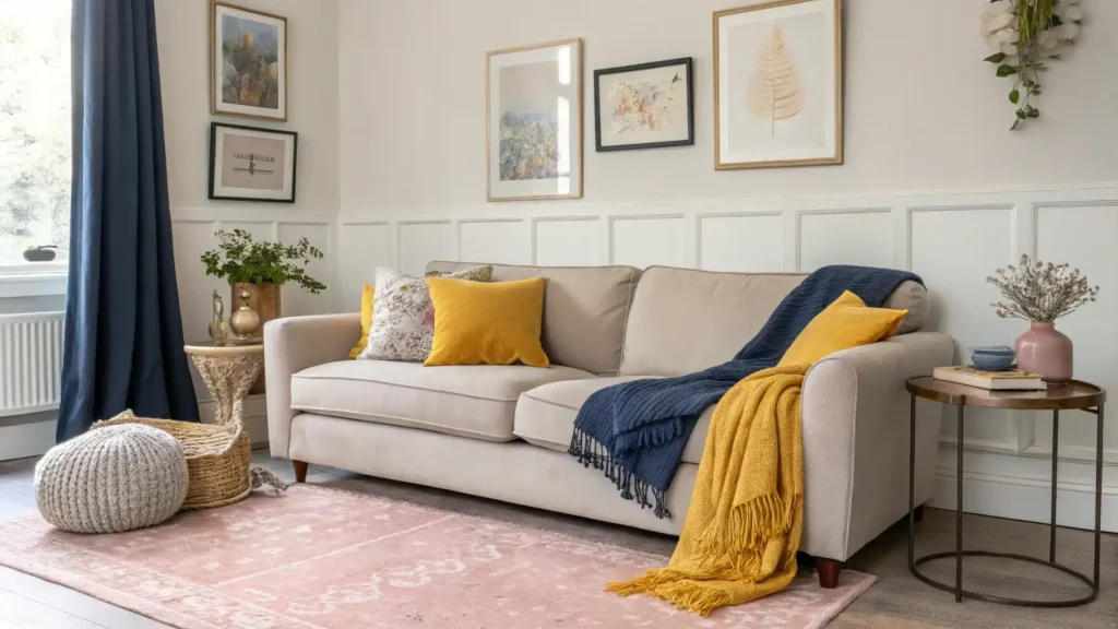
The Power of Neutral Colors
Never going out of style, neutrals kind of rule the color palette. They work with everything, anchor bold colors, and bring timeless calm.
Moreover, whites, light grays, and beiges can be your power hues. Rotation of pillows, throws, and artwork can add to the seasonal accent every time. Consequently, this approach keeps things flexible without ever feeling bland year-round.Bring Seasonal Decor Alive with Vibrant Colors
Colors for Spring
Color for Summer
Colors for Autumn
Colors for Winter
Final Color Combination: ASAP Design Tips
Follow the 60/30/10 method: Primary color 60% (sixty percent), secondary color 30% (thirty percent), accent color 10% (ten percent).
- Accent Colors Recurrence: Take a single chosen shade as an accent aesthetic element to all rooms for a harmonious, cohesive look.
- Mixing and Matching with Textures: Depth and elegant chic can be achieved via mixing, matching, and layering fabrics, metals, and wood in myriad forms.
- Initial Sample Testing: Apply small patches or strokes of color onto the wall before the final painting to ensure it looks good in both natural and artificial light.
Takeaway: Let Colors Tell Your Story
The combo of emotion, energy, personality, and practicality factors into the color theory. Do not consider it as just paint in a container; instead, therefore, see it as a powerful tool for shaping your environment.
Intentional and inviting is what a mindfully planned home color palette is. The power of color theory, moreover, comes to the fore in all its glory via your home’s distinctive character, seasonal perspective, and creative inclination.
Take tiny steps in the beginning by picking the hues you love. Go with your instincts. Hold your breath, and meanwhile, contemplate, and wield your brush on the canvas called home.